Yichuan Wang: Stocks for the Long Run—Still a Wild Ride

I am delighted to be able to host another guest post by Yichuan Wang. Yichuan has appeared on “Confessions of a Supply-Side Liberal” in many capacities (as you can see by typing “Yichuan” into the search box down low on my sidebar), but this time it is as a student in my “Monetary and Financial Theory” class. This is the 13th student guest post this semester.You can see the rest here.
I use simulations of stock market histories to show how long run investing is much more risky than is commonly believed. I show that:Long run average stock returns are a poor judge of how safe stocks are over longer runsReasonable levels of risk aversion can generate scenarios in which stocks deliver the same long run expected utility.Let’s first set up the simulation. Below is a stock price index for the United States from FRED. Stocks tend to trend upwards in the long run, and even when things go down in say 2002, they tend to go back up afterwards. This history makes it look like in the long run, you’re guaranteed to make money.
But as a first approximation, returns in one year should tell you nothing about returns in the next. After all, if you knew returns next year were going to be all of a sudden higher, you would have bought today! Formally, this means that returns can be approximated as being independent over time. So let’s try an experiment. In the data above, the average return in a given year was 7.5% with a standard deviation of 13 percent. Let’s generate returns that follow independent normal distributions with those properties, run it for 40 years, multiply all the returns, and see what stock prices look like:

And so even when returns from year to year are random, you still see “trends”. After the fast run up in the red line, there’s a “natural” pop of a bubble around year 34! But after a few years, you recover again. Hence this model of independent returns is plausible both from an economic theory perspective, and the graphs also look reasonable.
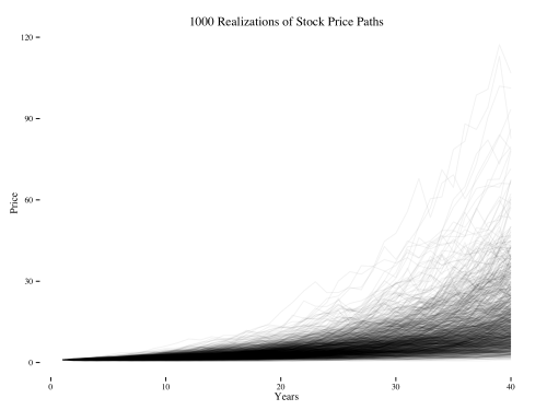
I generate 1000 such paths, and then they start looking like the plot below. Each black line represents some alternative history of the world in which returns every year had a mean of 7.5% and a standard deviation of 13%.
Now that we’ve run the simulation, we can see some interesting phenomenon:
- Cumulated stock returns can be huge! In some of the best histories, you’ve increased your wealth by a factor of 100 over the course of 40 years. On the other hand, a 2% annually compounded bond would have only put you at a factor of 2.
- But most of the final returns aren’t that high. Hence when we say that you can expect to earn a lot from holding stocks for 40 years, much of that expectation is being driven by the extreme right tail of extremely high returns.
- In contrast to the Malkiel graph on the variance of average returns declining over time, it’s clear that the variance of total returns increases over time — the graphs get farther apart! And when you retire, you care about how much wealth you have left over at the end, not some accounting number about how much on average you earned over the past 40 years. In other words, it’s the variance in total returns, not average returns, that matters. Therefore long run average returns are a poor judge of the riskiness of long term investing.
Let’s turn to the second claim. Stocks usually beat bonds handily. But what happens in the nightmare scenarios in which they underperform?
To evaluate these scenarios, we need to plug in the cumulated returns into some kind of utility function. To make it easy, I consider two utility functions — CRRA utility with a risk aversion of 2† and log utility — and then as a comparison I plot just the raw total return. The key part about the utility functions is that there is diminishing marginal utility — a 1 million dollar loss hurts a lot, whereas a million dollar gain isn’t nearly as salient. This means that people are averse to risky gambles such as the stock market, but are still willing to make the bets if they think it will raise expected utility.
Below are the 1000 paths of utility and cumulated returns. The leftmost panel is just the plot of raw cumulated returns from above. The middle plot is what those returns would mean for log utility, and then the right plot is what utility looks like with a risk aversion coefficient of 2. The red line in each plot is a benchmark for what final total return or utility would look like if you instead invested at a risk free rate of 2%.

These charts show two things:
- No matter your utility function, the probability of stocks outperforming bonds is the same. Roughly the same number of black lines are below the red line in each plot.
- But when the black lines go below the red line when risk aversion is higher (see far right), the results are catastrophic.
Any measure of risk needs to both take into account the probability of losses and the magnitude of those losses. So as a benchmark risk measure, let’s compare the expected utility of investing in stocks relative to bonds:

Average stock returns trounce bond returns. But once you raise the risk aversion coefficient to 2, the expected utility from bonds is higher than expected utility from stocks. This is because stocks sometimes do really bad, and those scenarios hurt a lot.
Risk adjusted stock returns in this simple model are no safer than a 2% bond yield, and looking at average annual returns tells you little about how much risk there is in stock investing. The motivation for long run investing must be deeper than the higher returns to stocks, but that will have to be saved for a future post.
† I use risk aversion of two because it’s considered as an upper bound based on labor supply data, and although more extreme values come from the asset pricing literature, the more extreme values just reinforce the point that risk aversion matters.